Bee populations infographic
Information Design
Infographic for Baby Boomer Demographic
Year
2024
Programs
Photoshop, Illustrator, Indesign, Figma
Skills
Primary and Secondary Research, Collaboration, Photo Manipulation, Design for Print, Information Design
I was tasked with creating an infographic for the Baby Boomer demographic about a topic of my choosing. Knowing the dire state of bee populations, I felt that it was an important topic to address. This project began by finding research on our selected topic and was followed by visualizing that information accurately through three different types of graphs. Each graph was to tell a piece of the story and all of the graphs had to be made into a unifying triptych so that the story was easily understandable and readable.
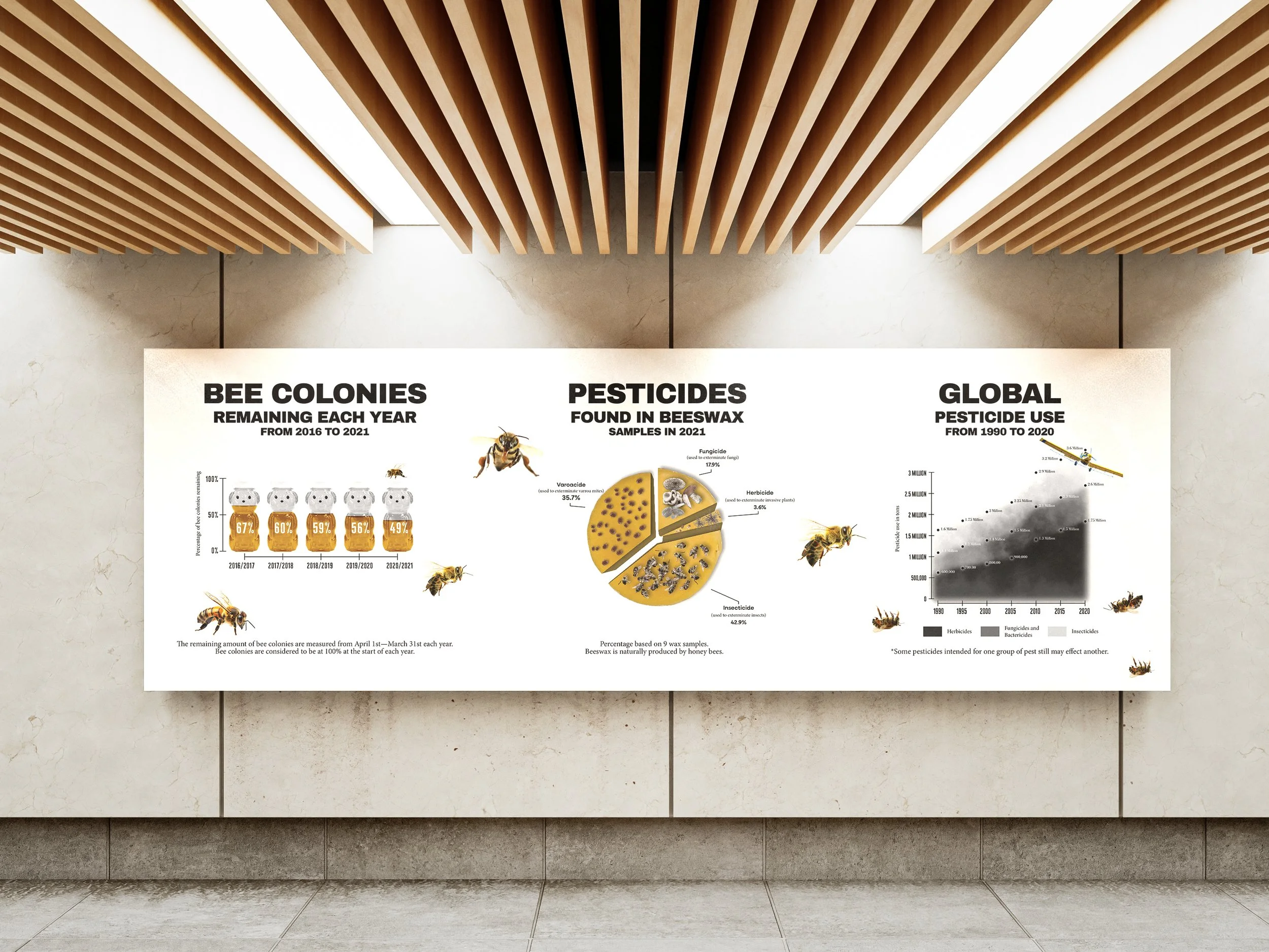
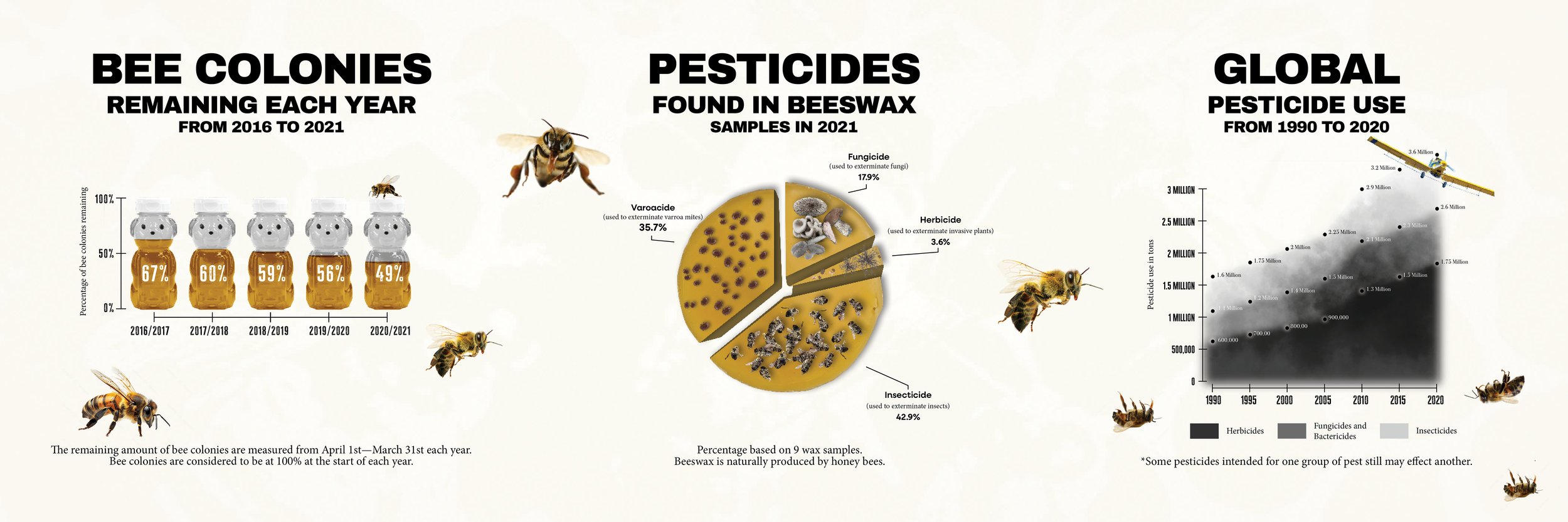
Problem: I was tasked with creating an information graphic triptych for the Baby Boomer demographic that encompassed three different types of graphs. The aesthetic of this triptych was to be based on the primary and secondary research that we gathered and shared about this demographic (colors, type, word choice, photo styles, amount of information, etc). We also had to gather secondary research for our selected topic.
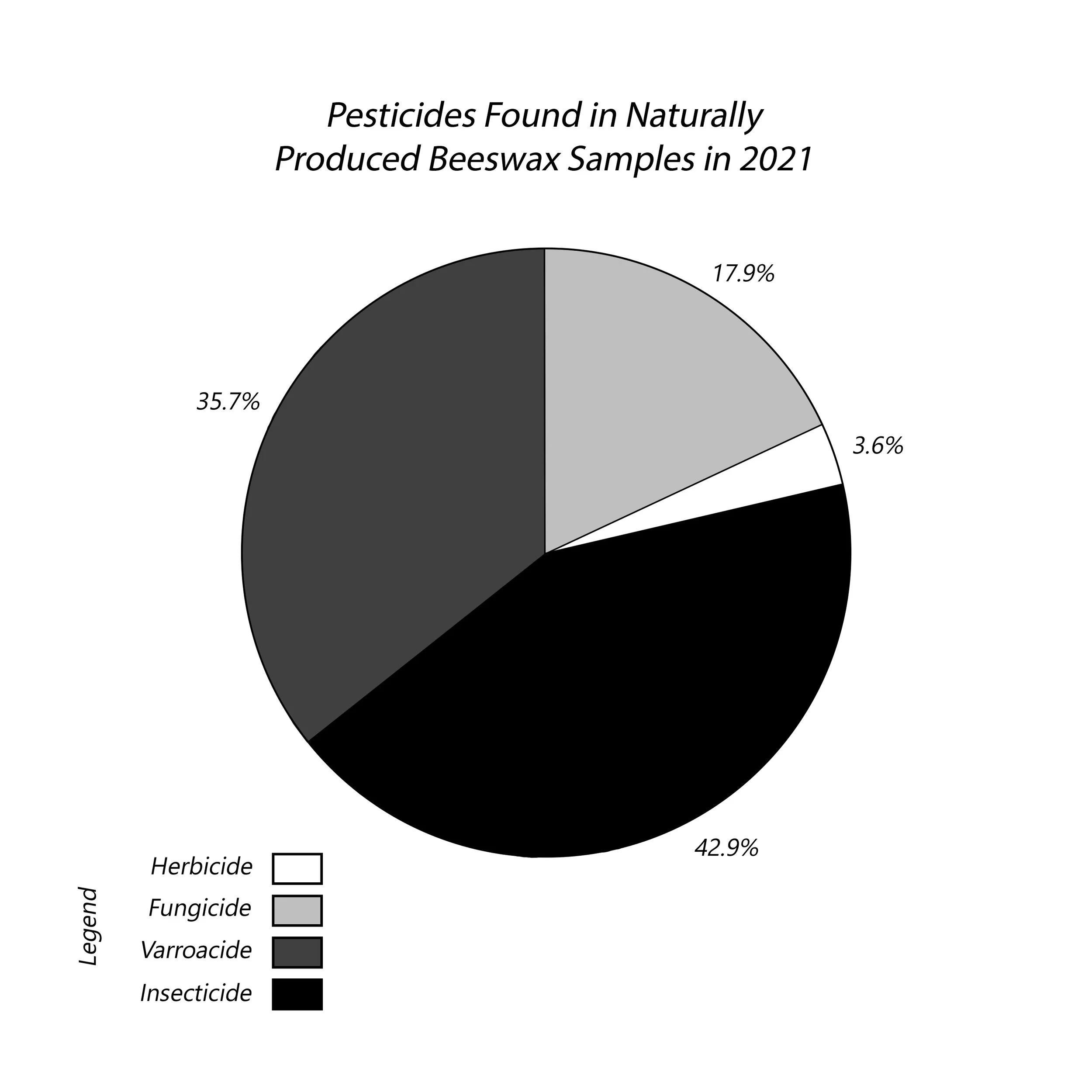
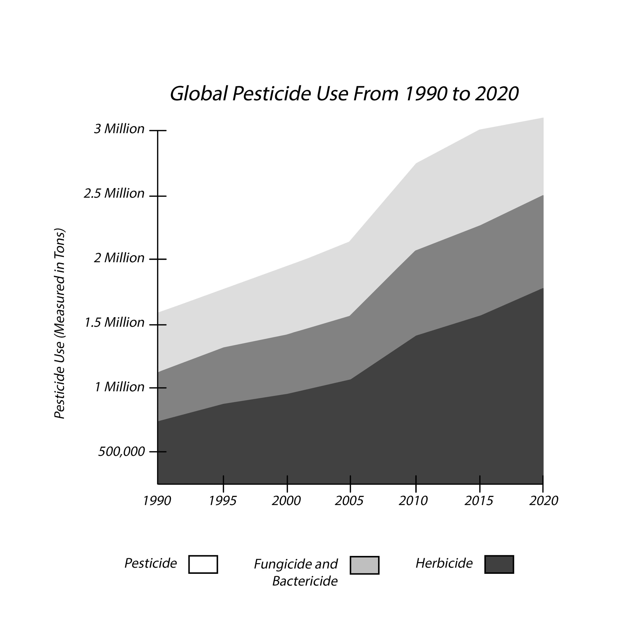
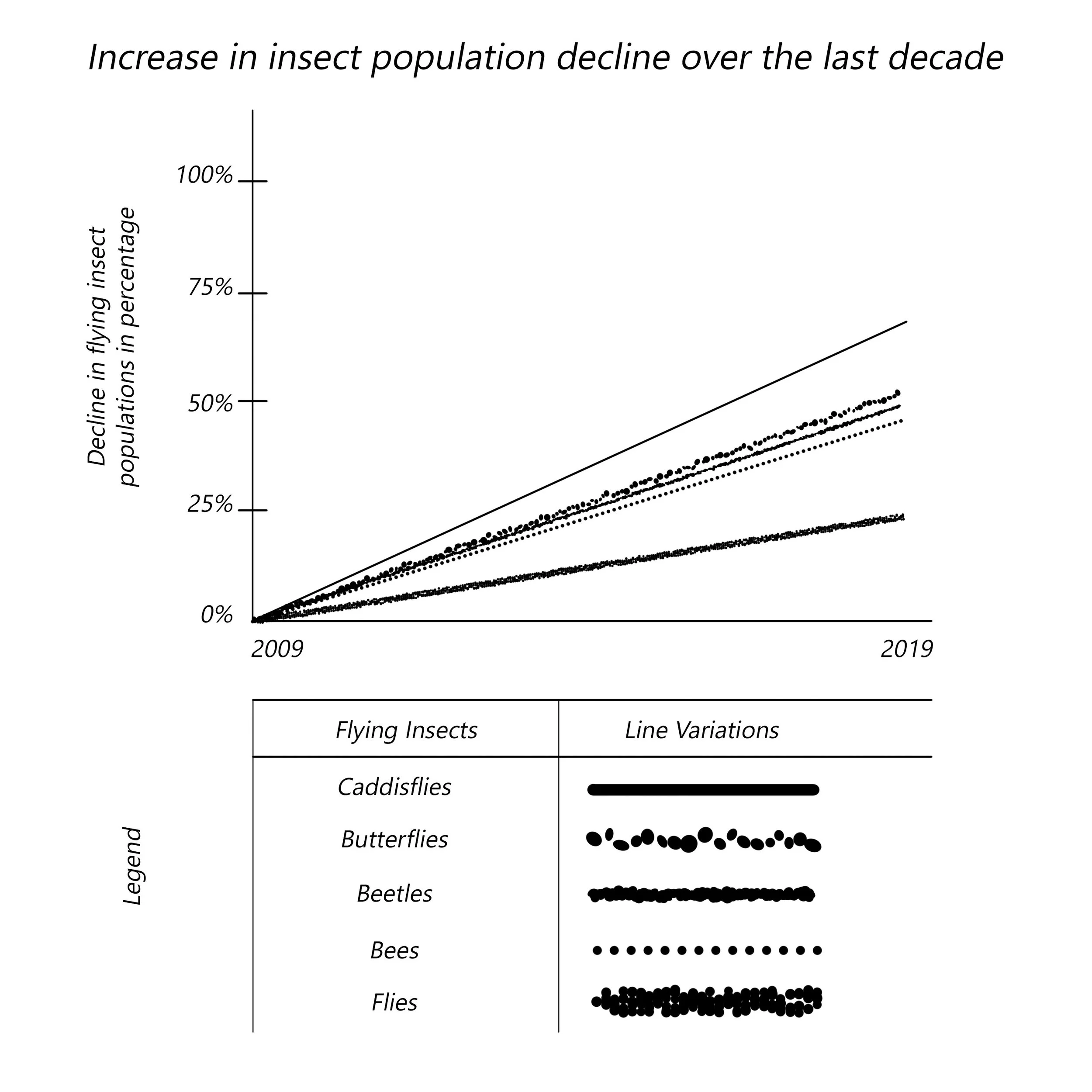
Solution: I chose to research bee populations and their relation to pesticides. Based on my findings, I felt it was best to create a graph that represented the population decline of bees in recent years (2016–2021), the types of pesticides found within beeswax samples in 2021, and the amount of global pesticide use from 1990 to 2020. I made sure the timeline of all of the information was relatively close so that the data was not misrepresented, I provided extra information below each graph to explain the data more thoroughly, and I used the imagery of bees dying as a secondary element of visual storytelling. I used jars of honey as pieces of a bar graph to represent the population decline of bees, images of dead bees, mites, fungi, and plants within a pie chart to represent various types of pesticides found in beeswax samples, and clouds of pesticides as elements of a line graph to represent their increased use over time (including the plane dropping pesticides to further visually explain the pesticide graphics). I also used somewhat muted colors (creams, browns, black, white, and gray), detailed information, and both bold sans serif fonts and smaller serif fonts to better communicate this data to the Baby Boomer demographic.
THE PROCESS
These are sketches, rough drafts, pieces of research, and feedback that led to the final product.
Information Design
Infographic for Baby Boomer Demographic
Year
2024